





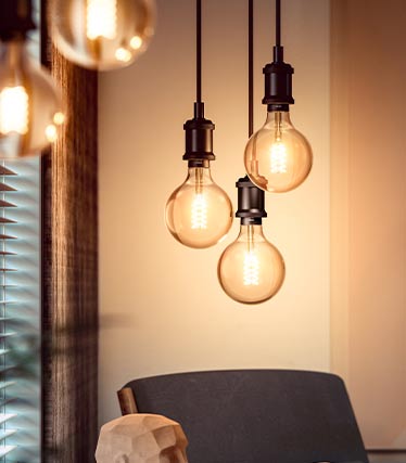




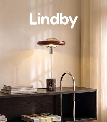











Lamps in deep shades of brown and red
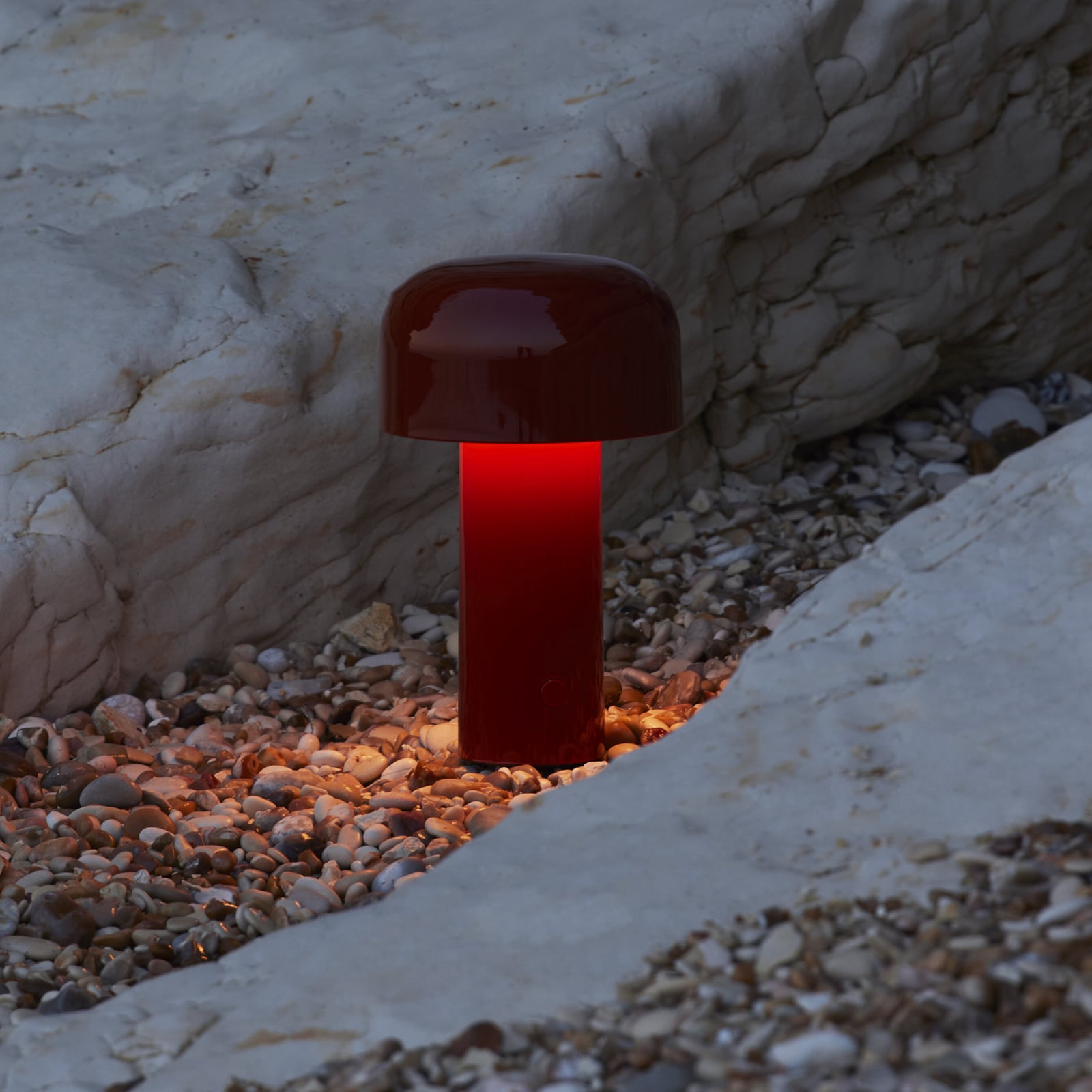
From mocha and chestnut to BurgundyDeep shades of brown and red lend the interior a special sense of tranquillity and intensity. The colour palette ranges from mocha to walnut and dark chestnut, evoking images of warm wood, coffee and chocolate. Rust and terracotta bridge the gap to the reddish tones, whilst Bordeaux and Burgundy lend a particularly rich and elegant depth.
The colours have a grounded yet expressive quality – at times understated and natural, at others intense and sensual. They look particularly beautiful in luminaires featuring tinted glass, fabric, ceramics, wood or metal, each of which interprets the respective colour in a very different way. Arranged in matching tones, this creates a calm, monochrome look. Individual light fittings in burgundy or rust, on the other hand, can be used deliberately to add a splash of colour. Taken together, the warm browns and reds are reminiscent of the deep colours of an autumnal forest, when dark earth, wood and red foliage blend together.
This season’s bestsellers and must-haves
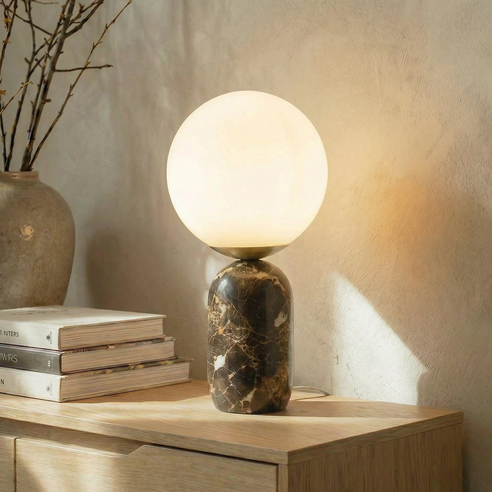

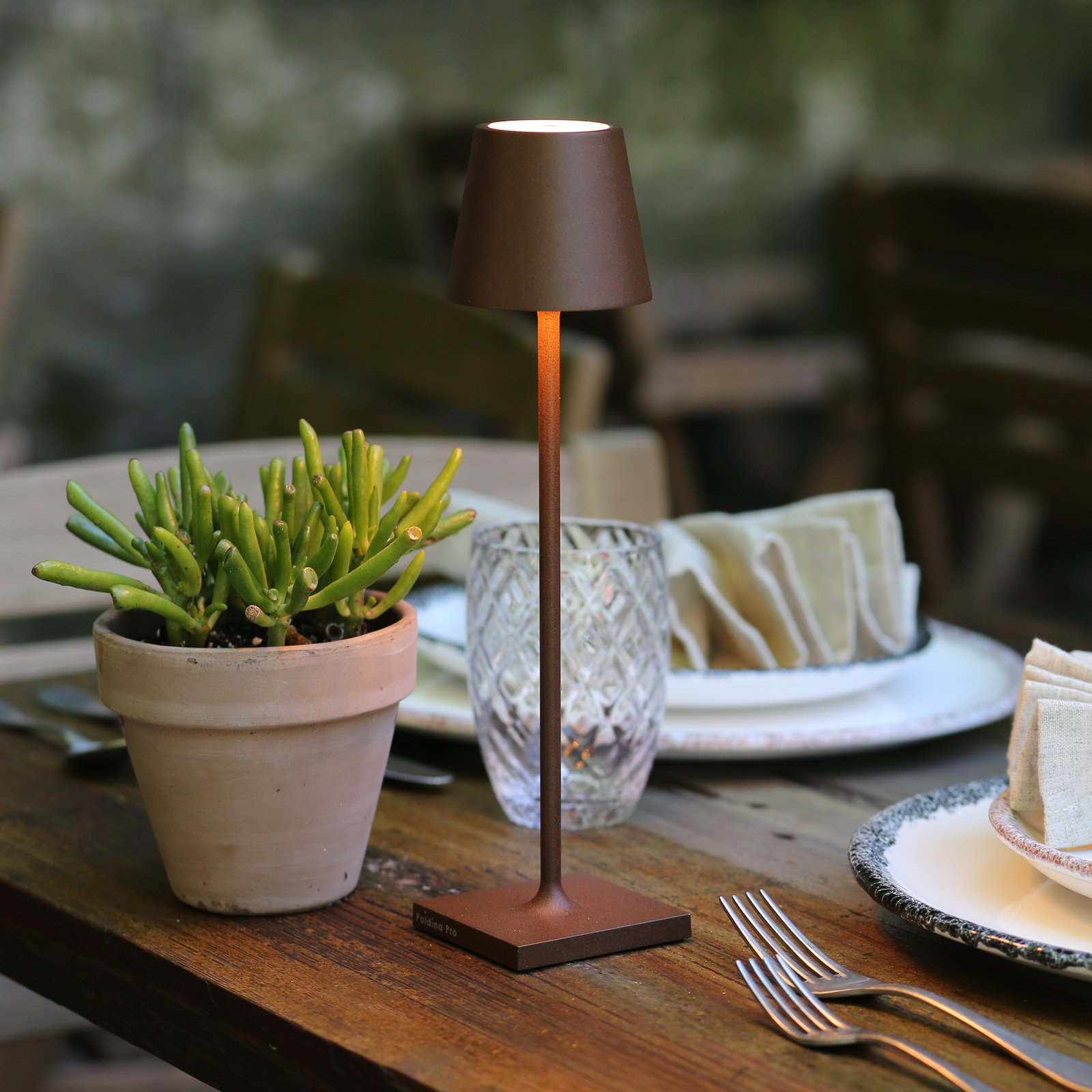


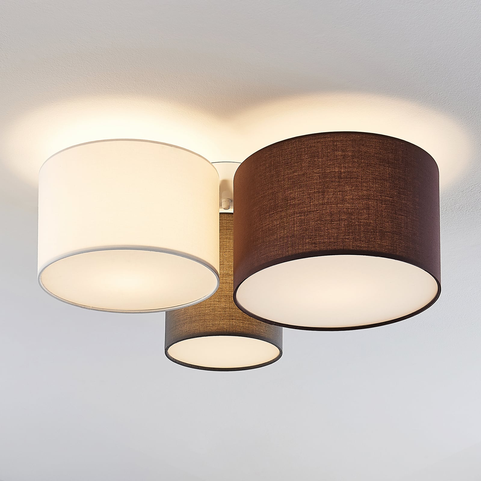

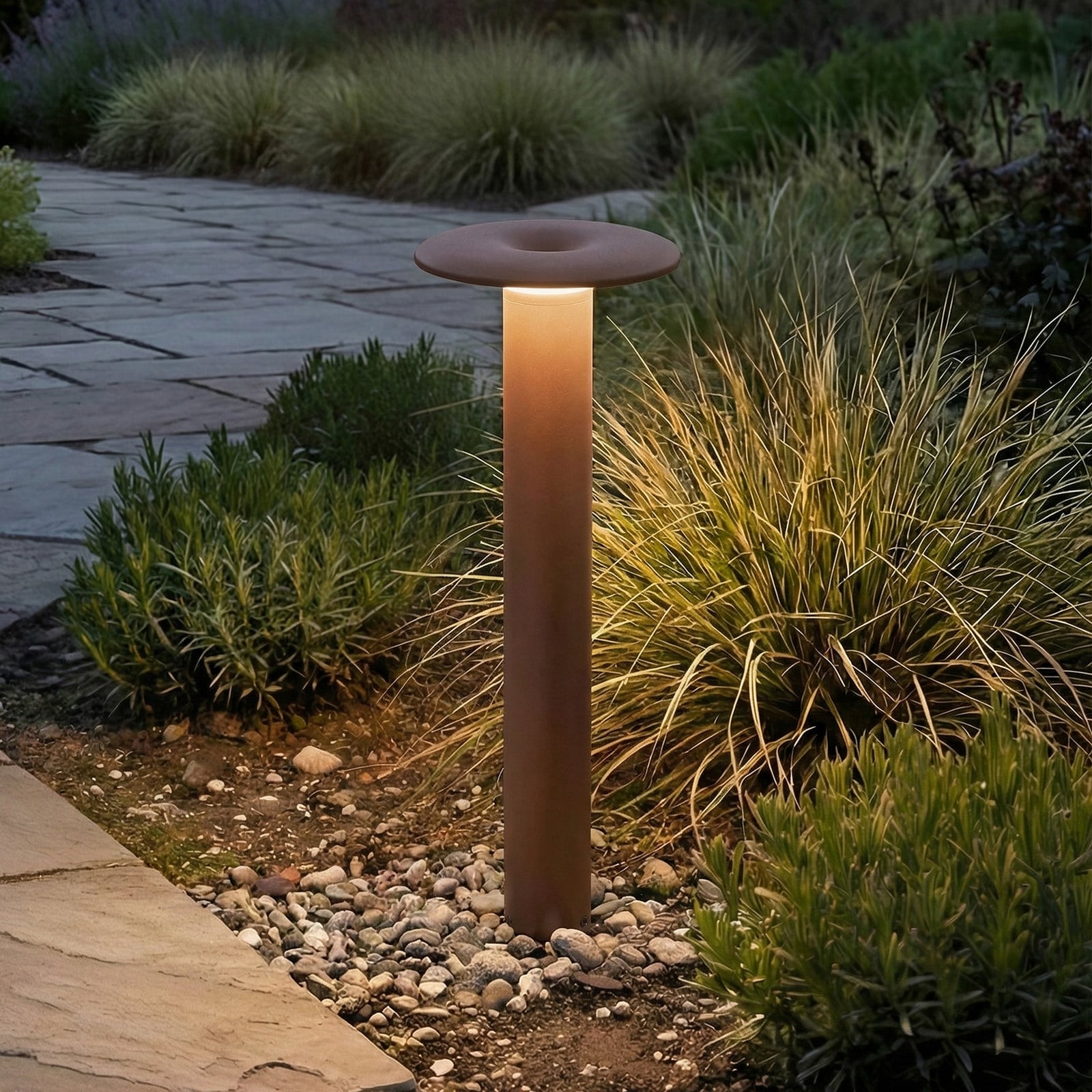

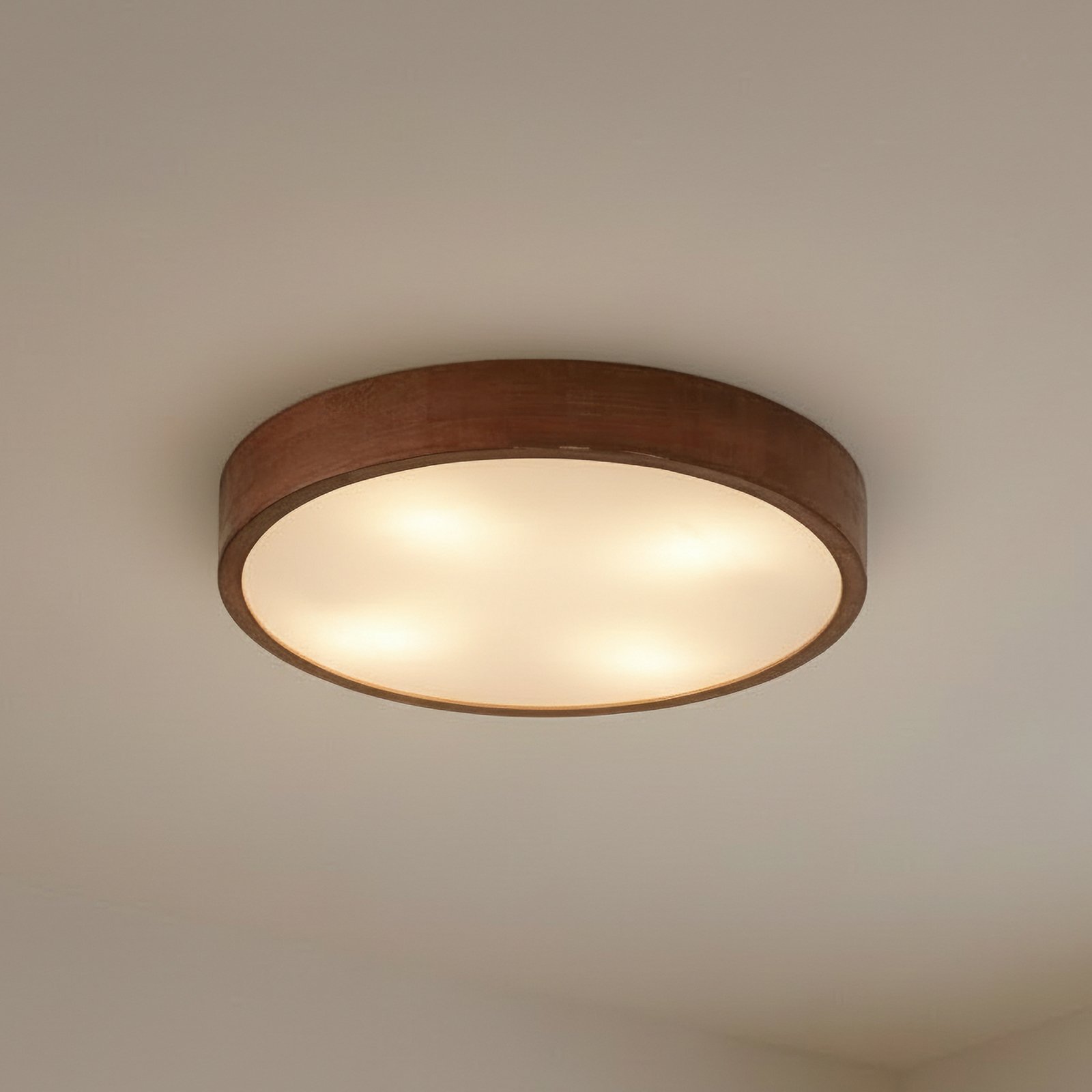
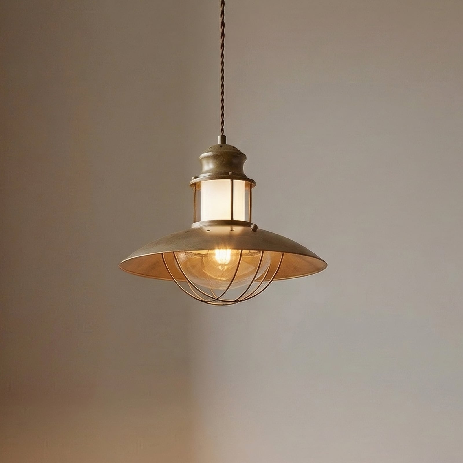
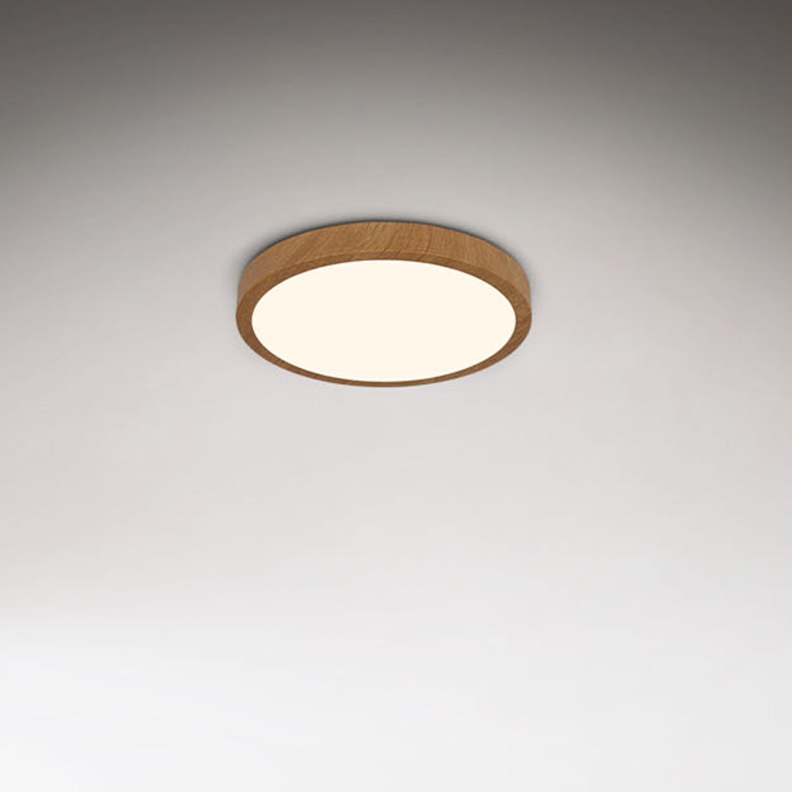

A journey into the world of browns and reds


The effect of deep colours
A sense of security, warmth and a touch of sensualityColours not only shape the way a room looks, but also the way we perceive it. Deep, warm colours often convey a sense of calm, comfort and stability. Brown is reminiscent of wood, earth and natural materials, and therefore has a grounded and familiar feel. Dark shades such as espresso, cocoa or chocolate also lend a room an elegant, cosy depth.
Shades of red bring more energy and expressiveness to this colour scheme. Rust and terracotta have a warm, natural feel, whilst Bordeaux and Burgundy appear more intense, sensual and somewhat more dramatic. They can add character to a room without necessarily making it seem loud. Dark shades of red are particularly effective when used as the colour of a light fitting: they catch the eye whilst creating a warm, intimate atmosphere.
The intensity with which the colours appear also depends on their surroundings and the light. Warm white light makes brown and red tones appear particularly rich and soft. When combined with wood, natural materials and muted colours, a calm, cosy atmosphere is created; when paired with lighter surfaces or clean lines, however, darker shades create a greater sense of contrast and a more modern look. In this way, brown and deep reds can be used not only to add colour but also to deliberately create a certain atmosphere in the room.
Our new arrivals in rich, woodland shades


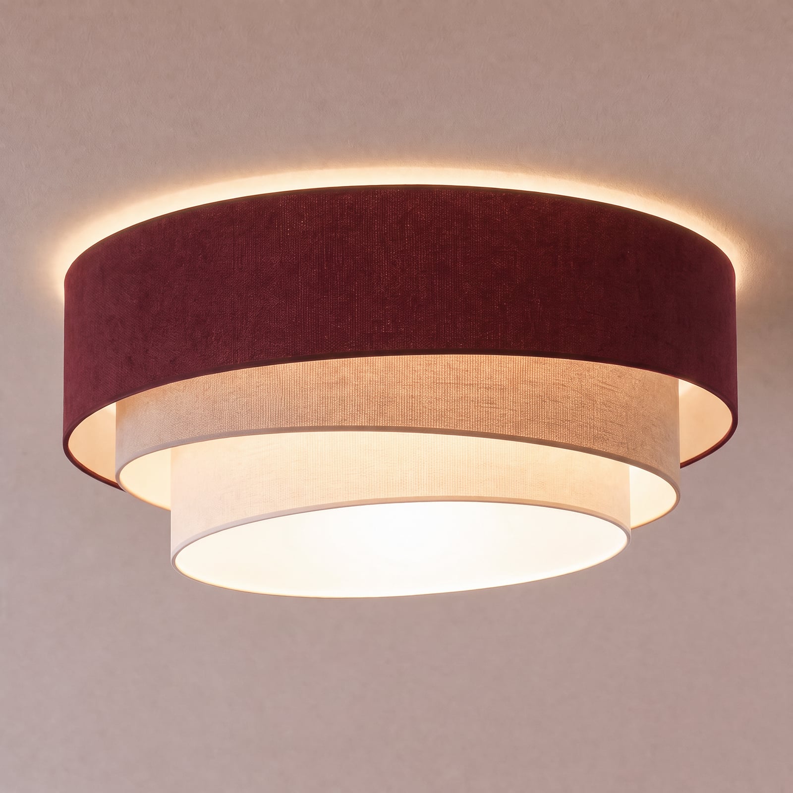







Floor lamps in brown, rust and burgundy
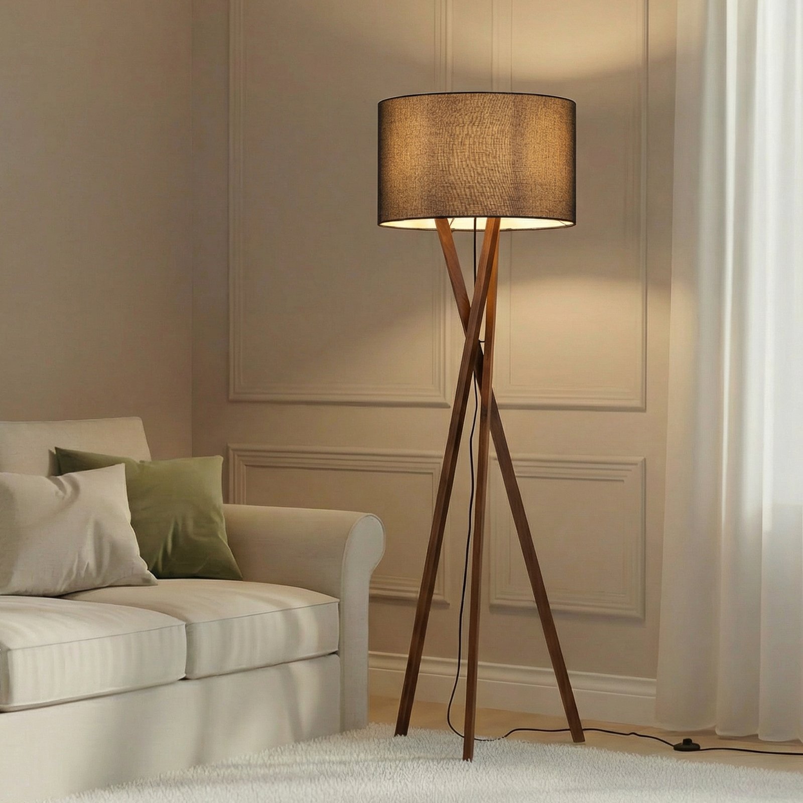
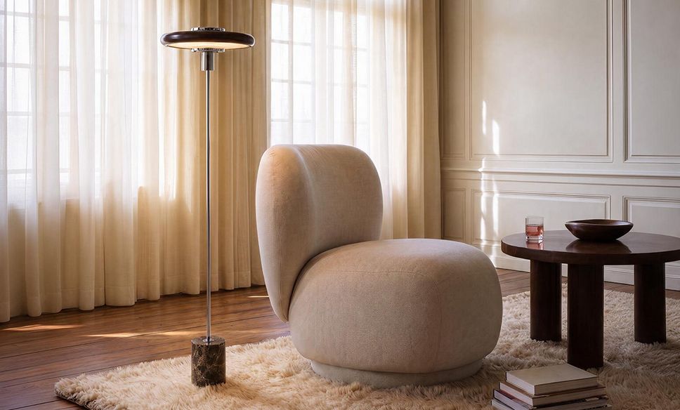
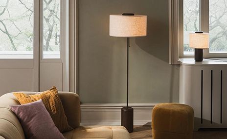
Cosy, characterful pockets of lightBrown floor lamps add depth to a room whilst looking pleasantly natural. Mocha, walnut, chestnut and chocolate brown exude a sense of calm and stability, whilst espresso lends a particularly elegant look. With shades of rust, terracotta or burgundy, the colour scheme becomes more intense and creates a more striking accent.
Alongside a sofa and armchair, in a reading corner or as an additional light source in the bedroom, floor lamps can really come into their own. The colour does not need to match other pieces of furniture exactly. It often creates a more intriguing effect to combine different shades: chestnut with cognac, chocolate with rust, or espresso with a deep burgundy. Warm white light really brings out the rich colours and enhances the cosy atmosphere.


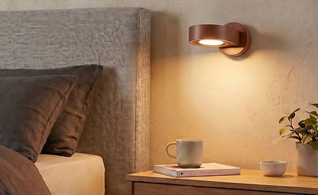
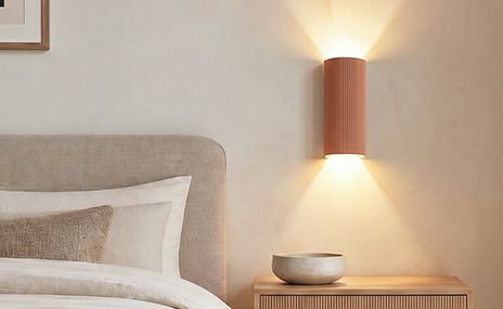
Wall lights in mocha, chestnut and dark red shades
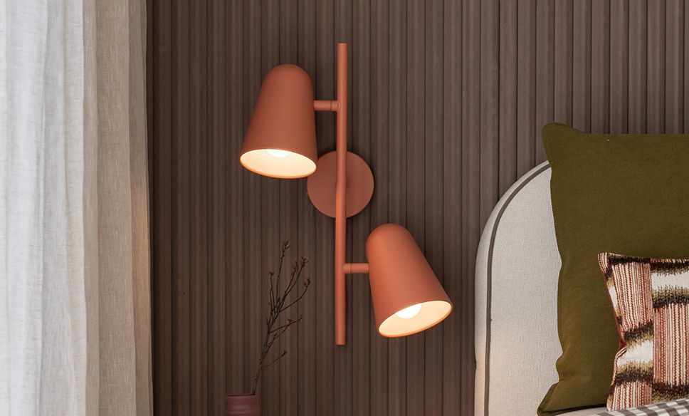
Soft light with a special charmWall lights in deep shades of brown and red combine atmospheric lighting with an expressive design. The effect of the colour also varies depending on the material: wood and bamboo emphasise the natural character, whilst ceramics have a warm, handcrafted feel, and tinted glass or lacquered metal lend a more elegant touch.
In hallways, bedrooms and living areas, dark wall lights create striking accents. A deep brown blends harmoniously into the décor, whilst rust, Bordeaux or burgundy add depth and character to a wall. This colour scheme looks particularly harmonious when combined with wood, natural stone and warm wall colours. If you’re looking for something a bit bolder, you could use a dark shade of red to create a deliberate contrast with neutral furniture.
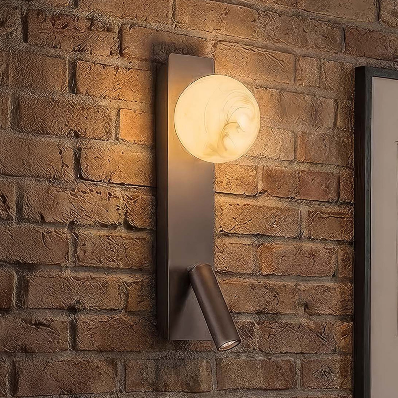

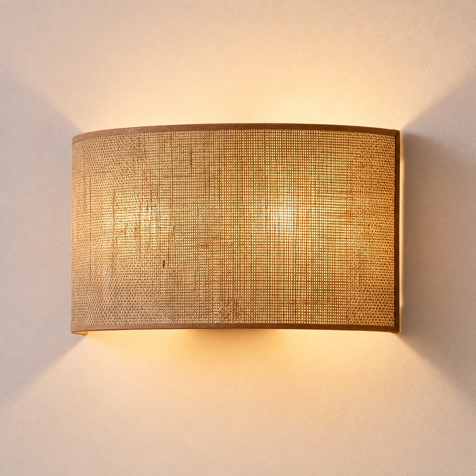
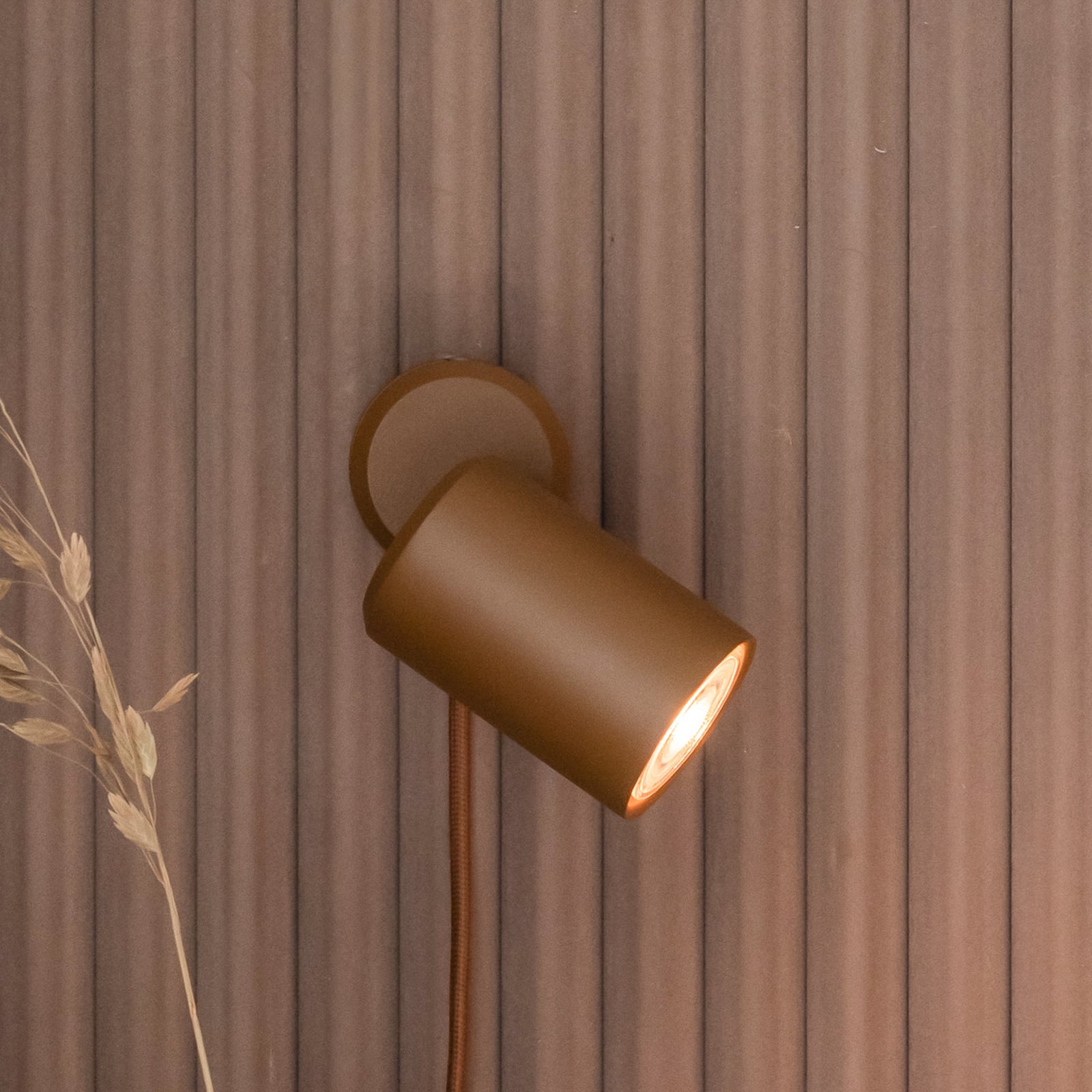

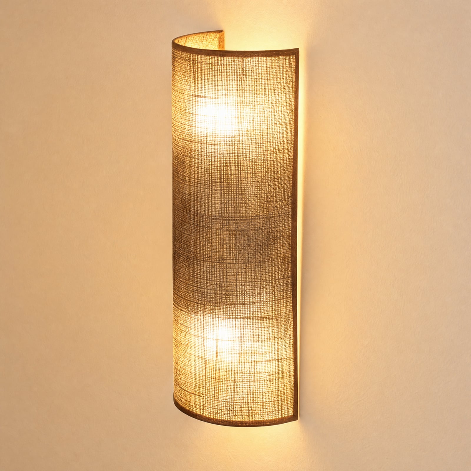
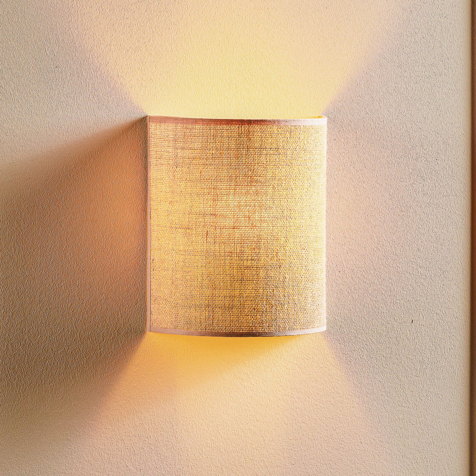


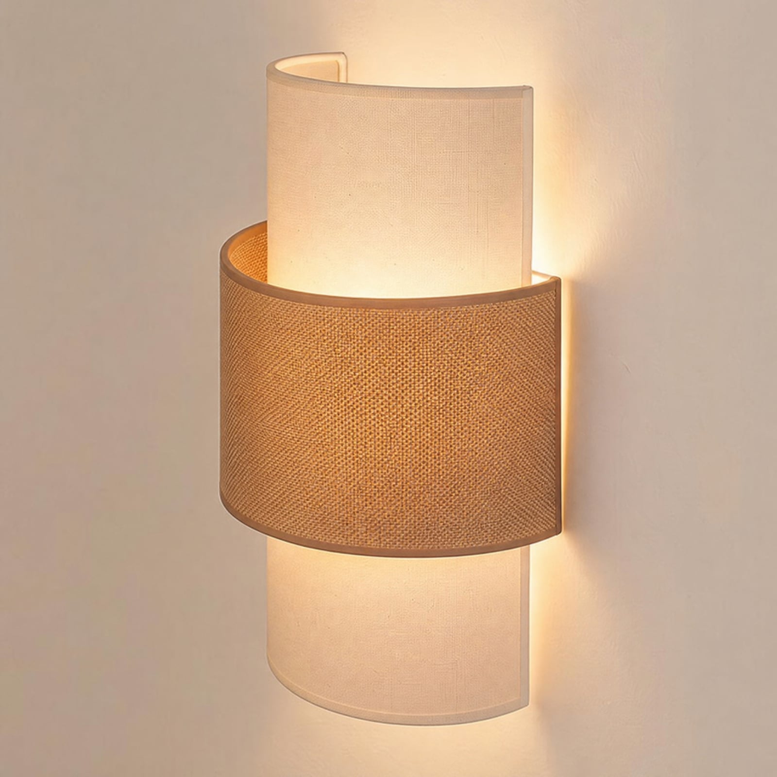

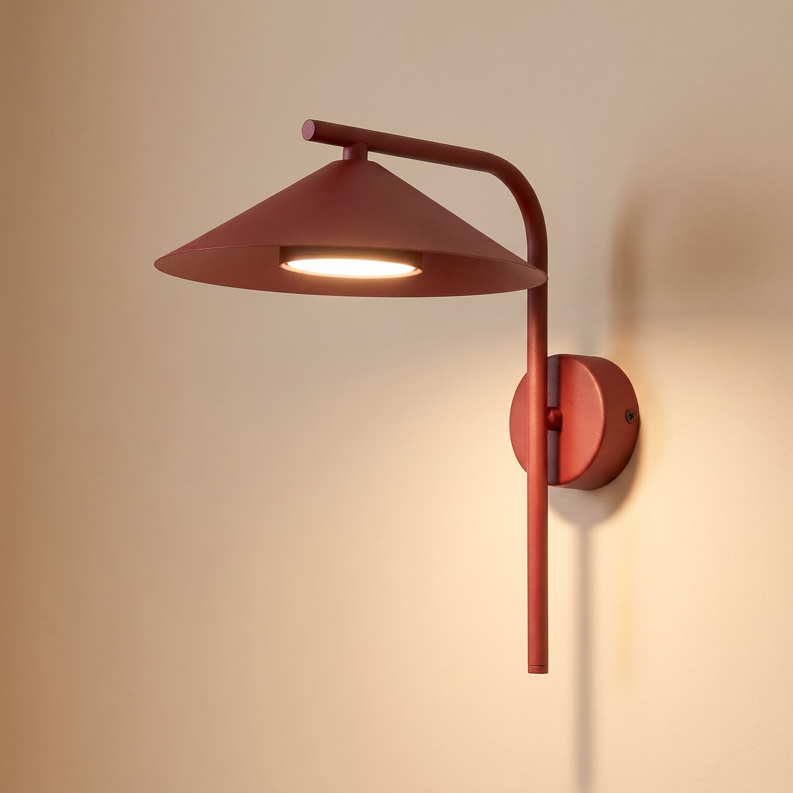

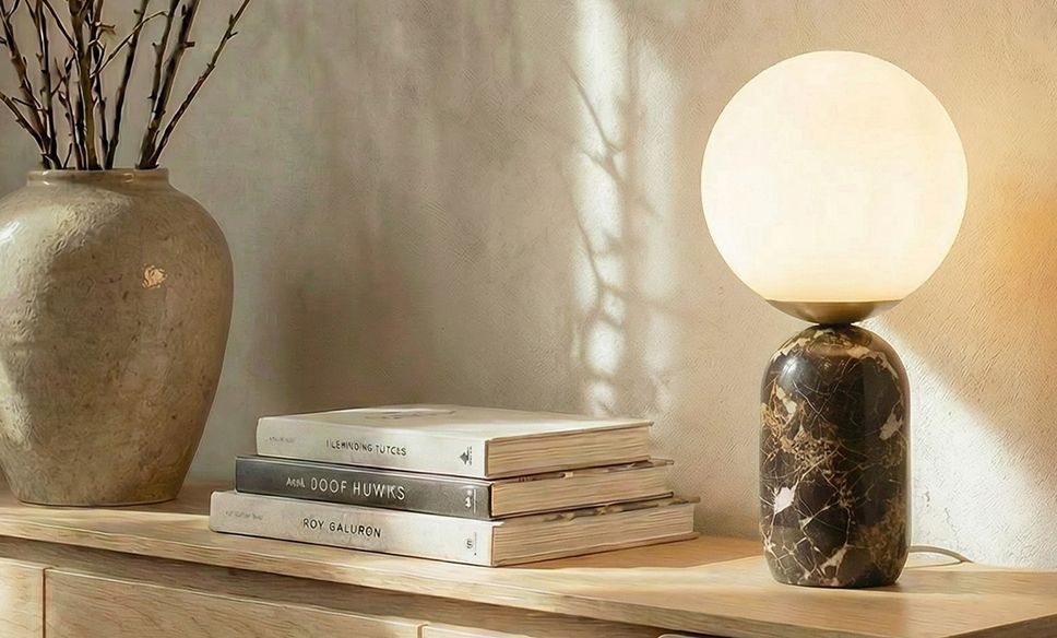
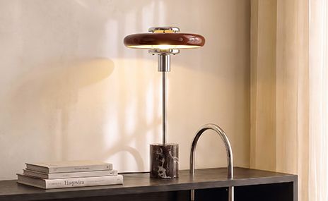
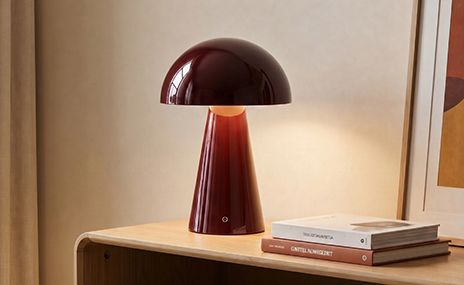
Table lamps in espresso, chocolate and burgundy
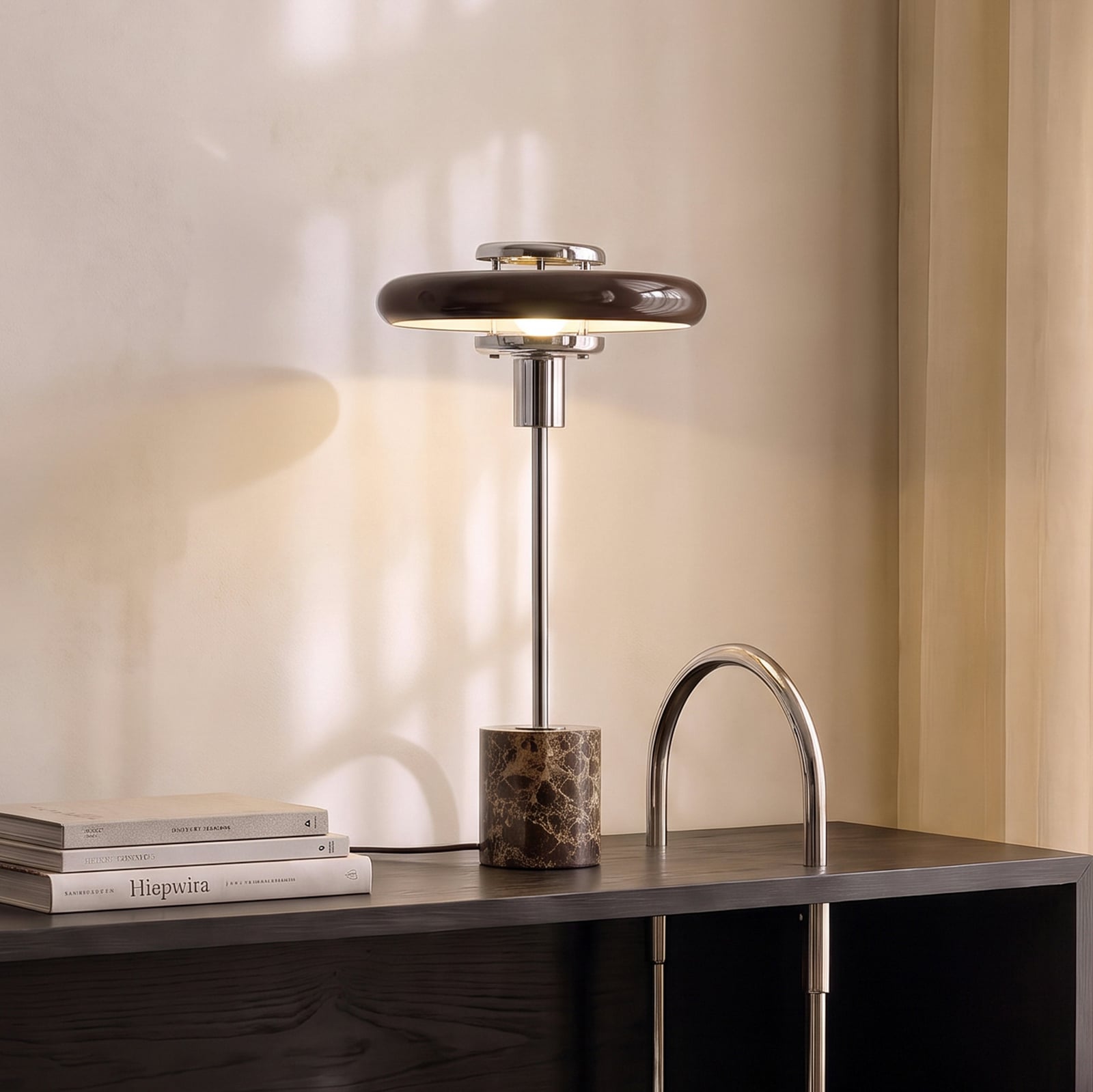
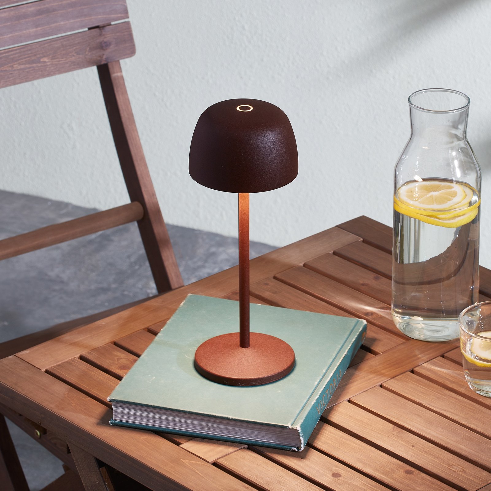
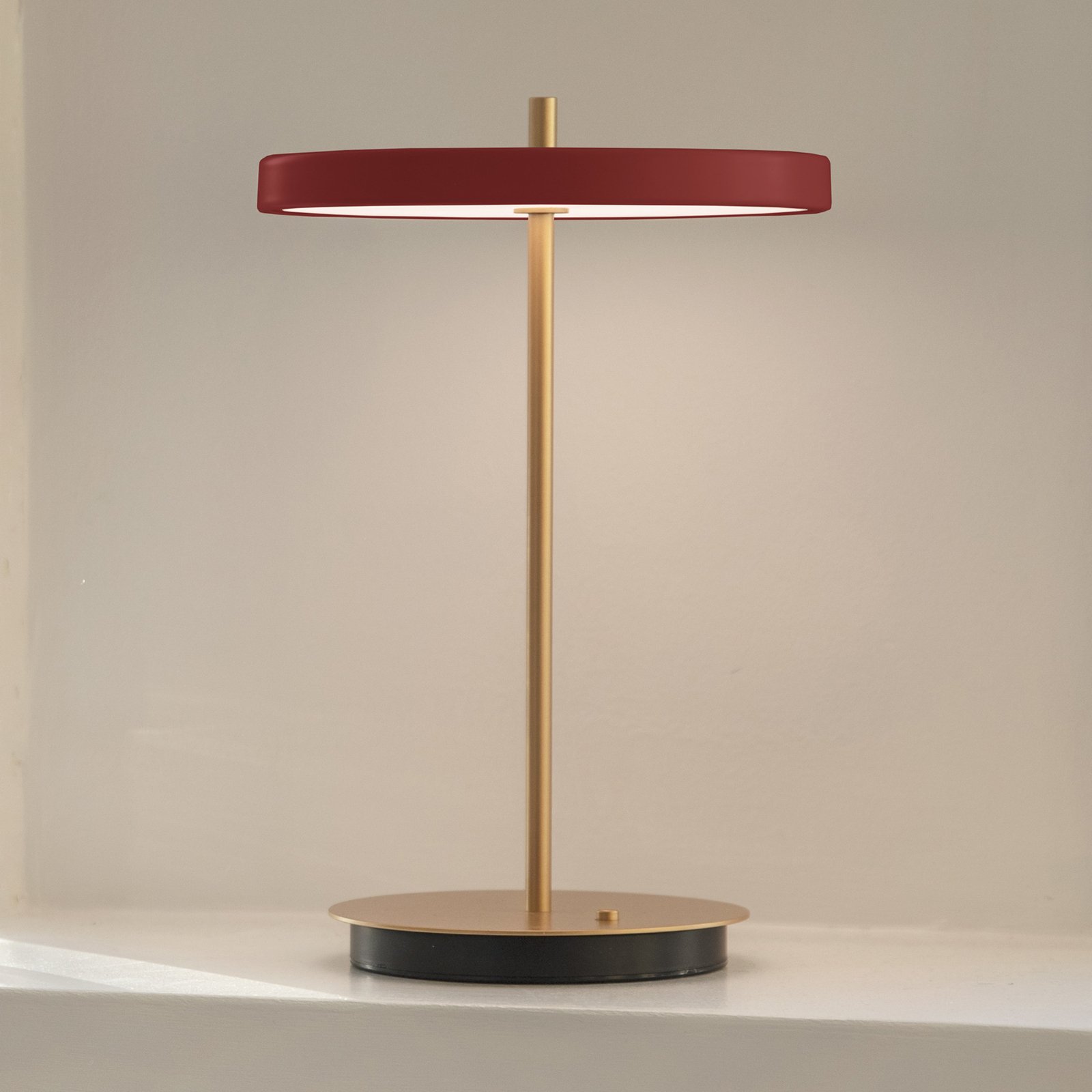
Rich splashes of colour for atmospheric lightingTable lamps are ideal for adding deep shades of colour to specific areas of an interior. Placed on sideboards, side tables or bedside tables, they become small design pieces that create a striking colour effect with very little effort. Shades of chocolate and chestnut create a calm and cosy atmosphere, whilst espresso is elegant and understated, and burgundy adds a bold splash of colour.
It looks particularly lovely when the colour of the light fitting is echoed elsewhere in the room. A burgundy-coloured piece, for example, can be coordinated with an armchair, cushions or a work of art in a similar shade of red. Different shades of brown can also be combined beautifully: mocha, chestnut and espresso come together to create a multifaceted, monochrome colour scheme. Tinted glass brings a sense of transparency and depth to the design, whilst ceramics have an earthy, soft feel and metal a more modern, precise look. In this way, one and the same shade can create very different moods.




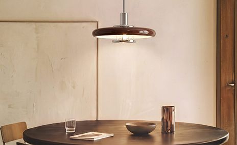
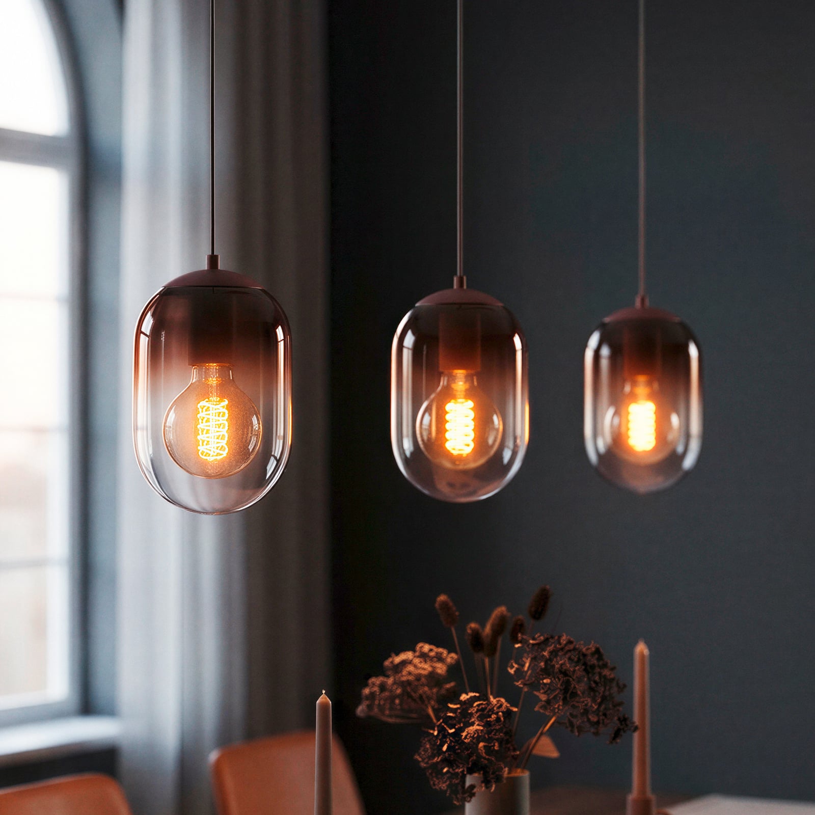
Pendant lights in brown, rust and burgundy
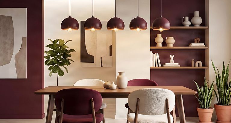
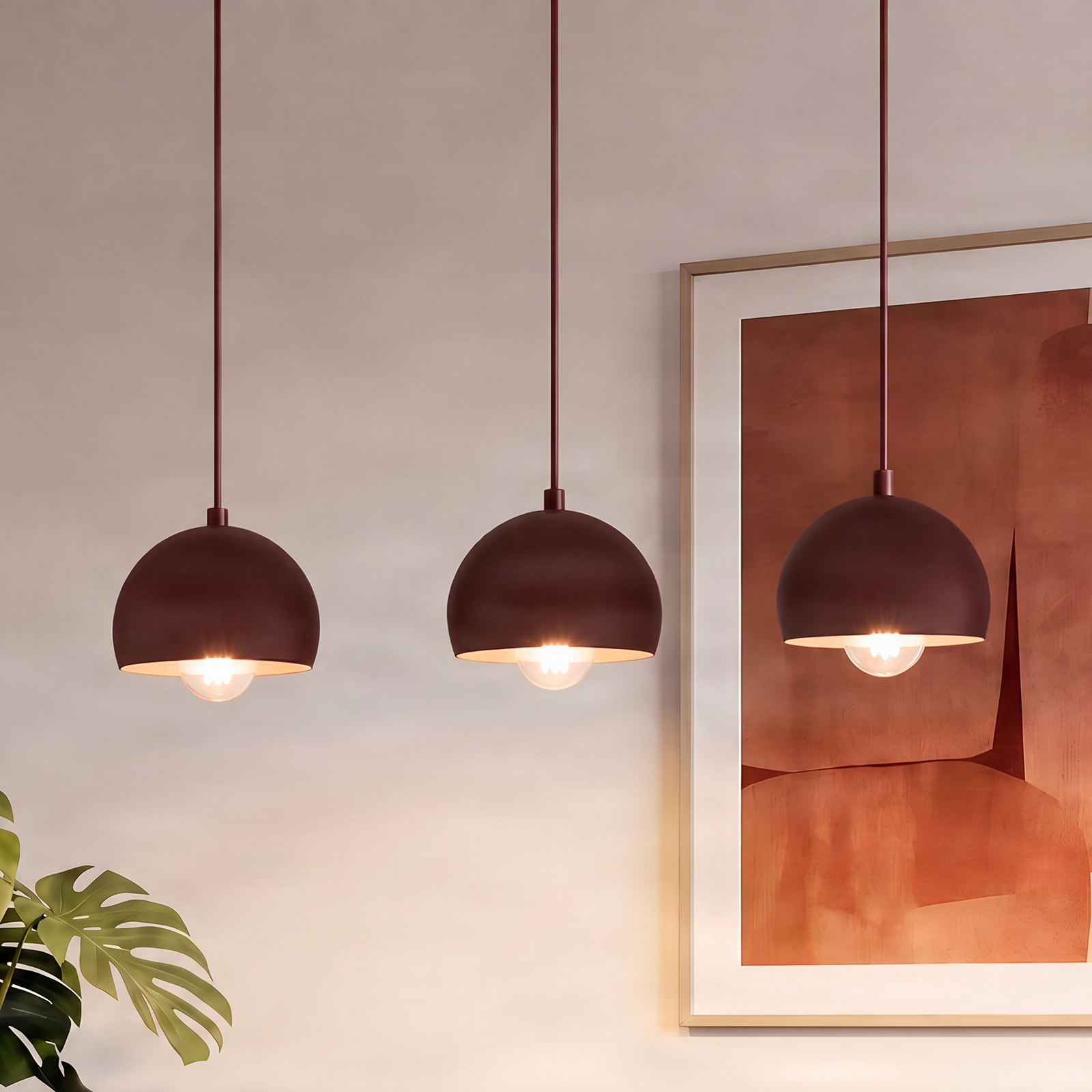
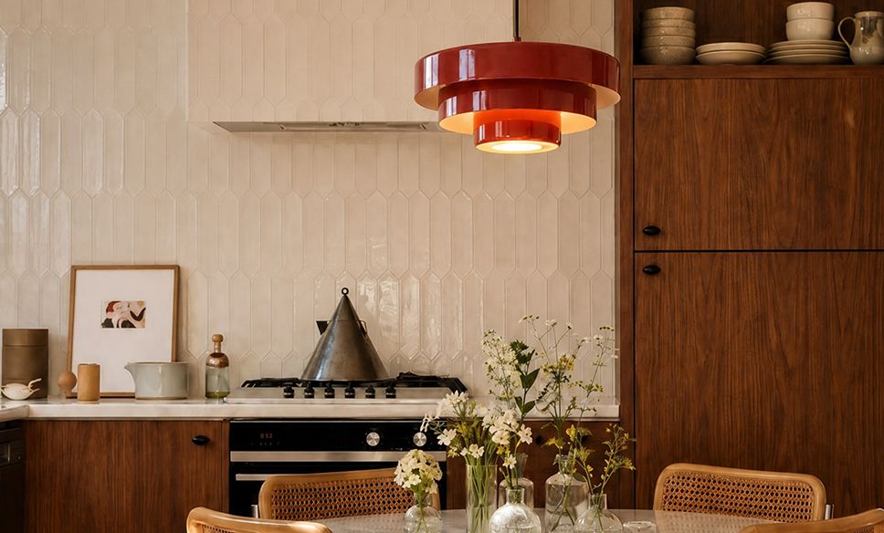
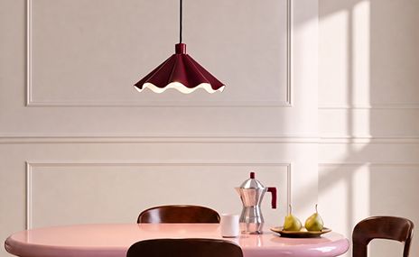
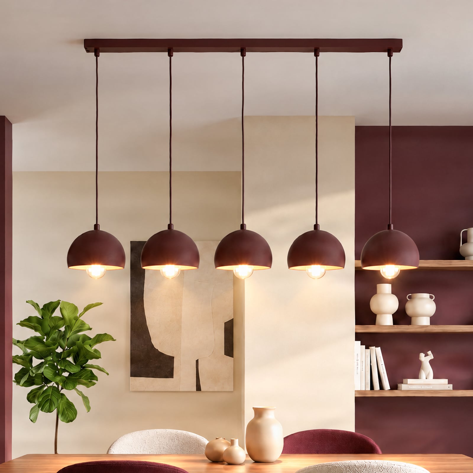
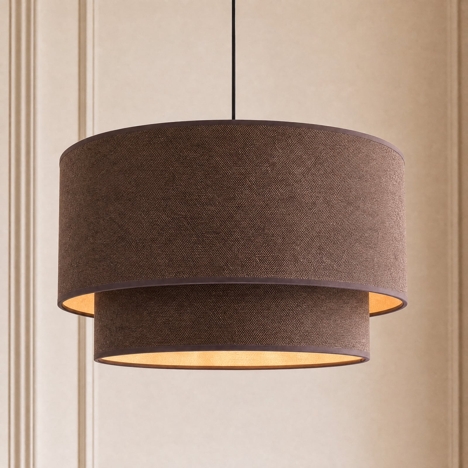
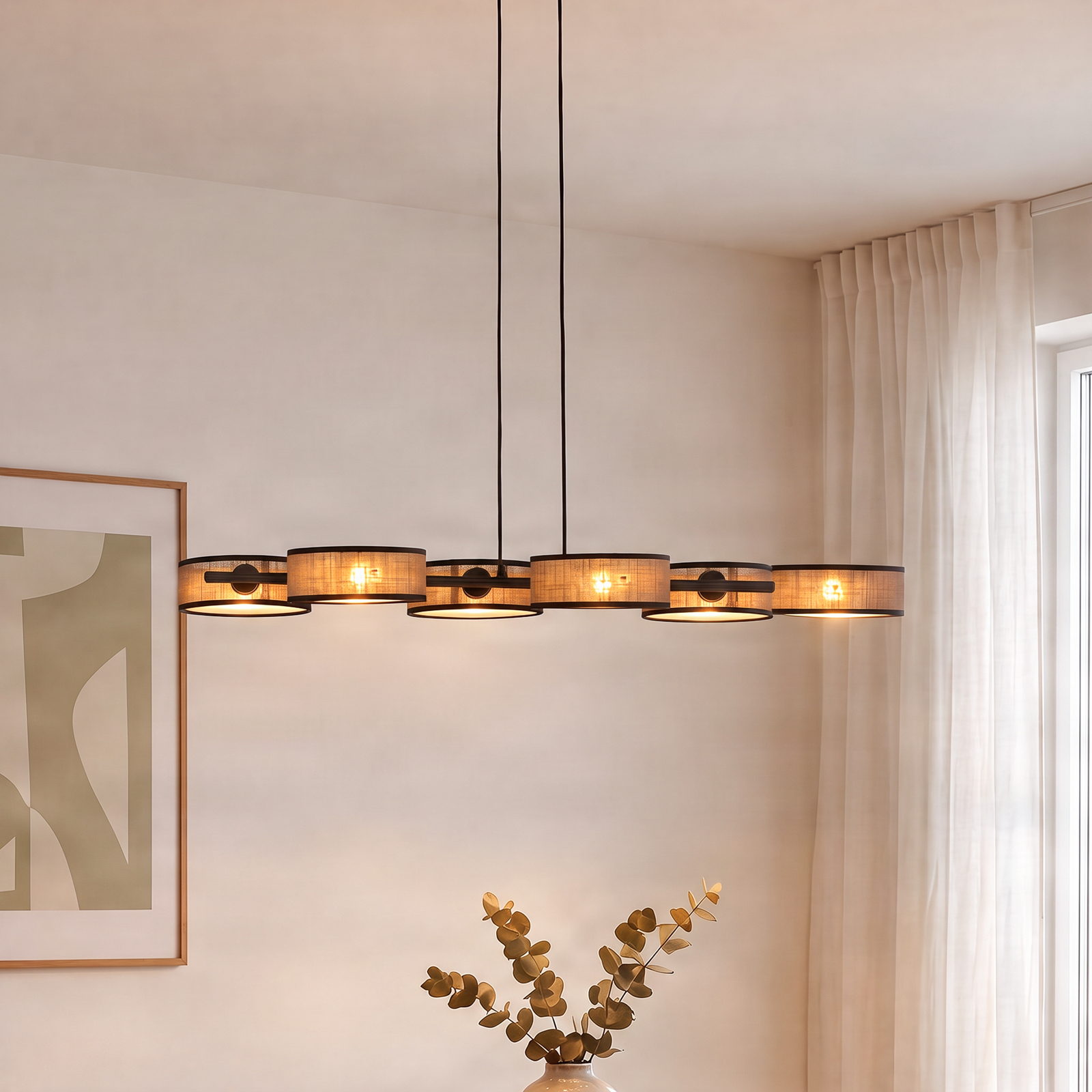
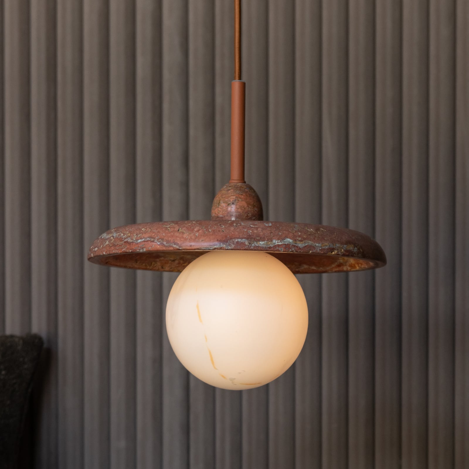
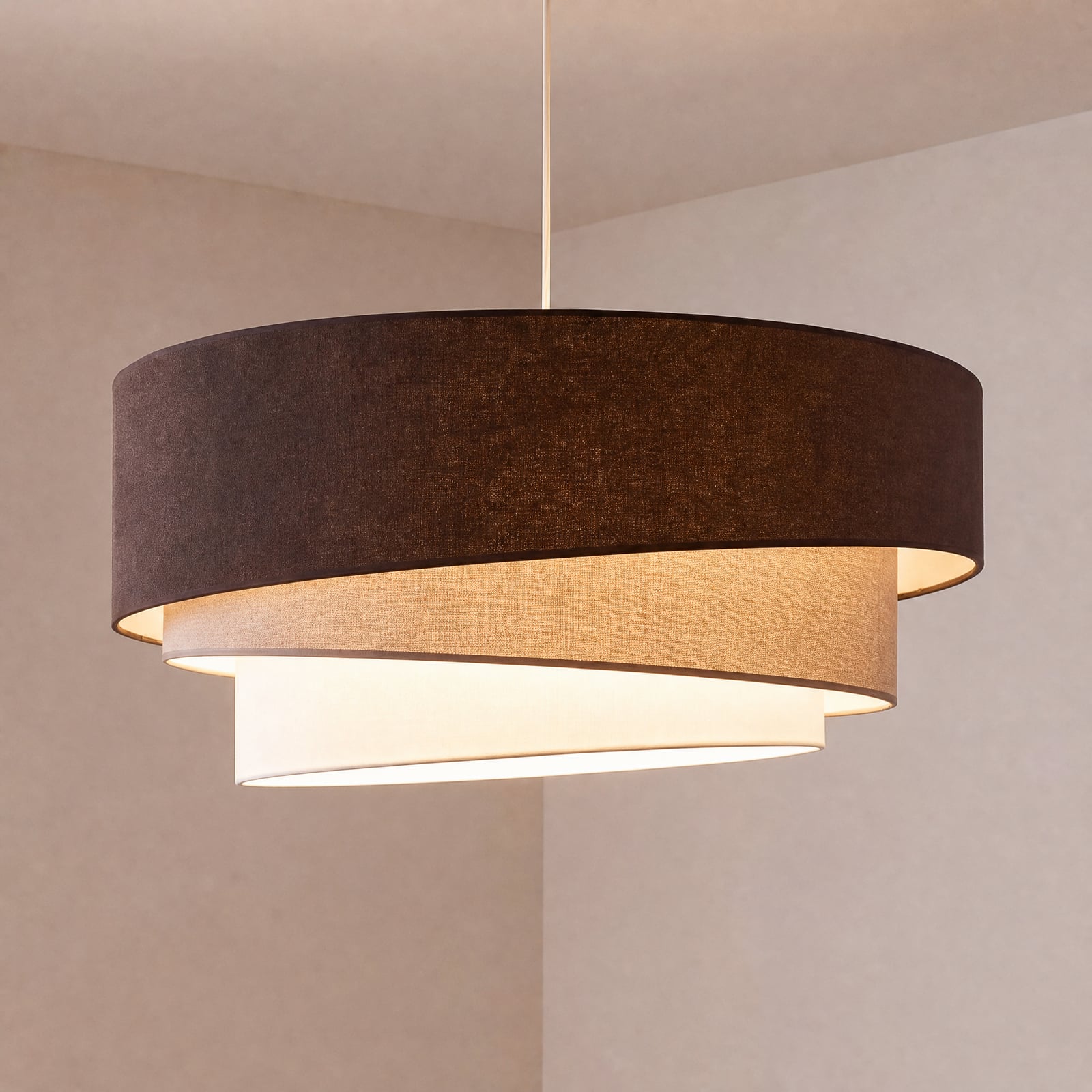
Eye-catching centrepieces above the dining table and kitchen islandLight fittings can be a little more eye-catching when positioned above the dining table or kitchen island. Pendant lights in deep shades of brown and red combine decorative appeal with a warm, cosy ambience. Dark brown has a calm and elegant feel, whilst rust and terracotta lend a natural, slightly rustic touch; burgundy, on the other hand, has a particularly intense and modern look.
Tinted glass gives dark colours a light and elegant look, whilst fabric shades lend them a softer feel. Wood, ceramics and metal also interpret the colour palette in their own way. It becomes particularly exciting when several lights combine different shades – such as chestnut, rust and burgundy. This creates a vibrant composition above the table, without the individual shades competing with one another.






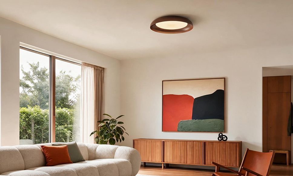
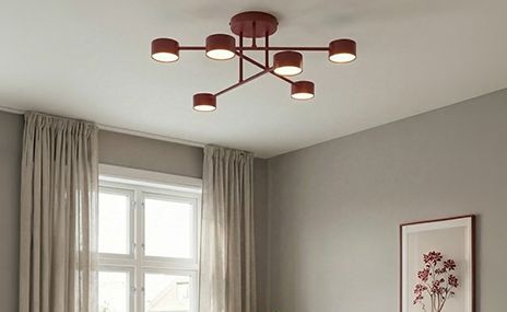
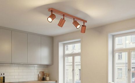
Ceiling lights in cocoa, chestnut and dark red shades
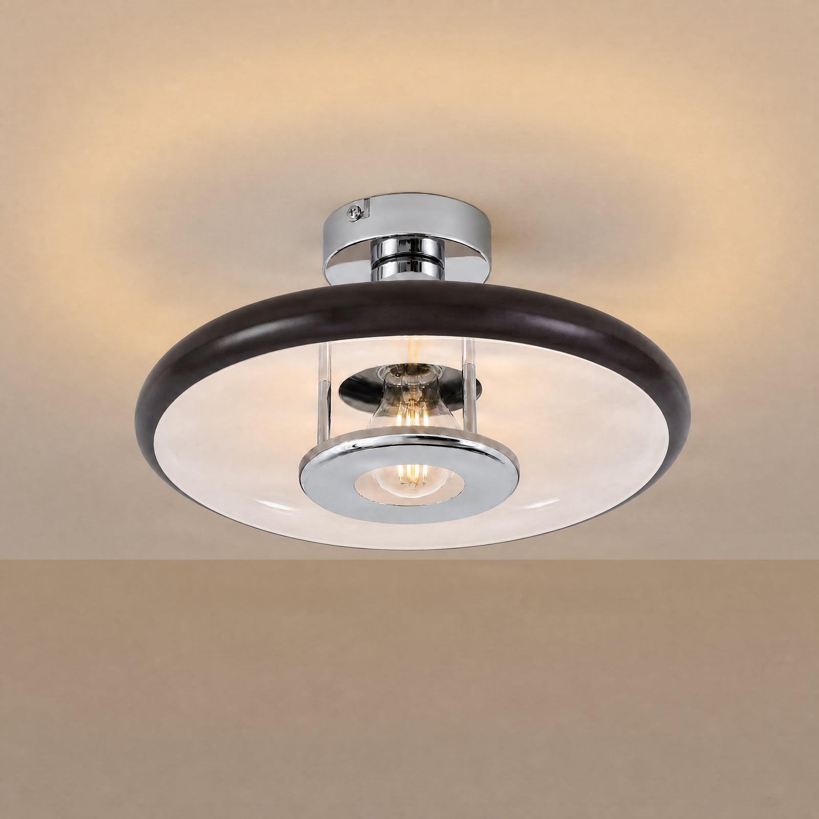
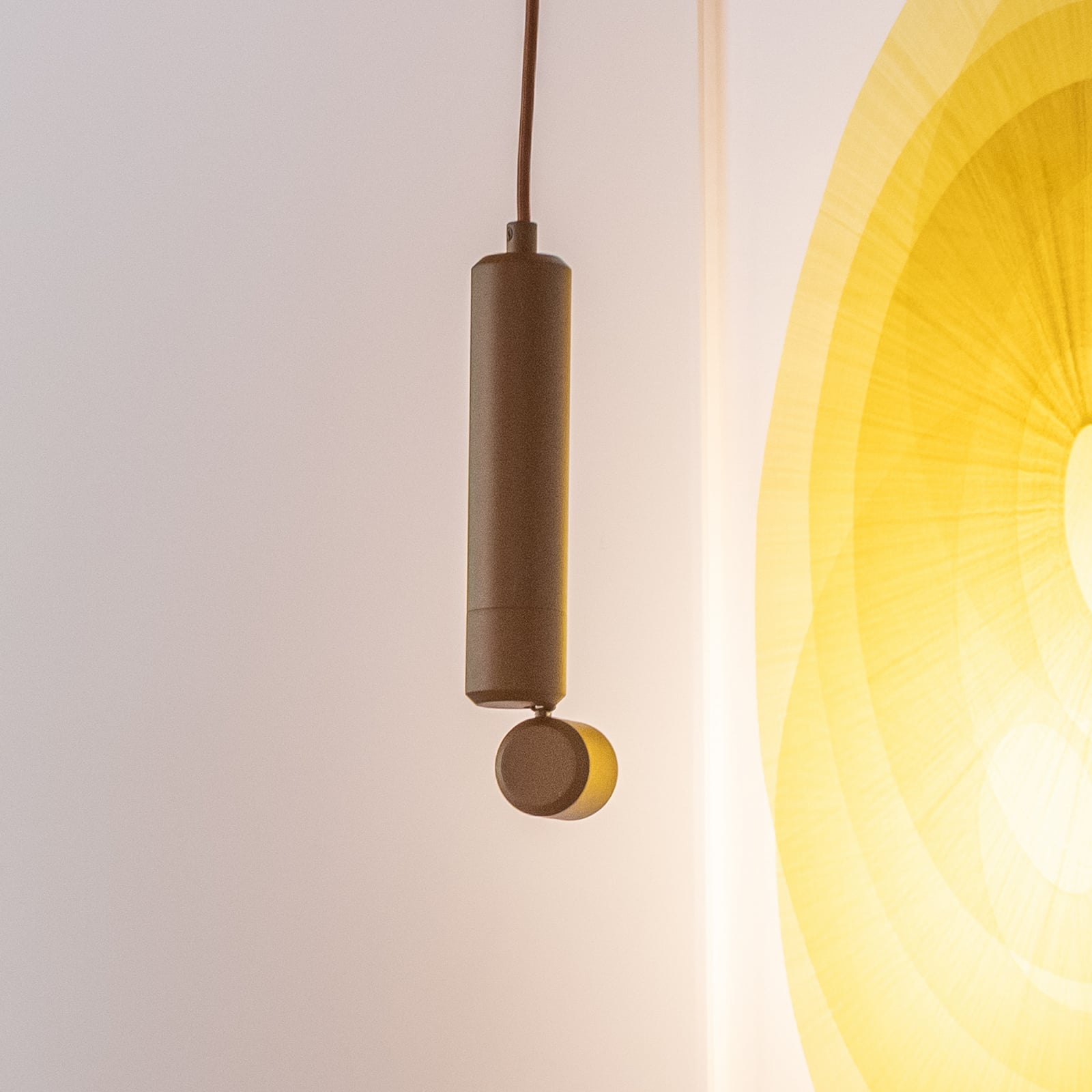
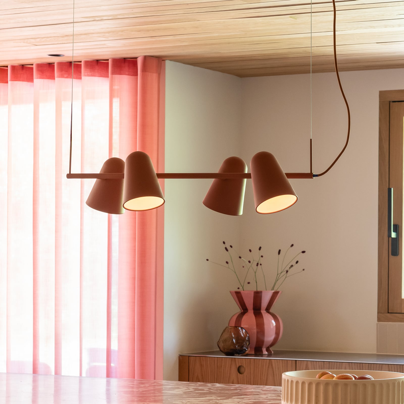
When general lighting becomes a design statementEven a ceiling light can add a splash of colour. Deep shades of brown and red take the functional austerity out of general lighting and make it a more integral part of the interior design. Cocoa and chestnut create a warm, calming effect, whilst dark chocolate brown feels particularly cosy. A deep shade of red or burgundy, on the other hand, adds a deliberate touch and gives the room more character.
These colours go particularly well with wood, linen, natural stone and warm wall colours. Textile shades soften the light, whilst tinted glass creates elegant reflections. If you prefer a subtle look, you can combine different shades of brown. A single burgundy-coloured design, on the other hand, becomes an exciting focal point in an otherwise understated interior.


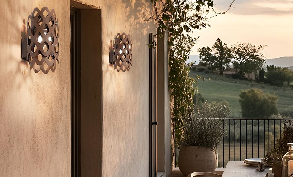
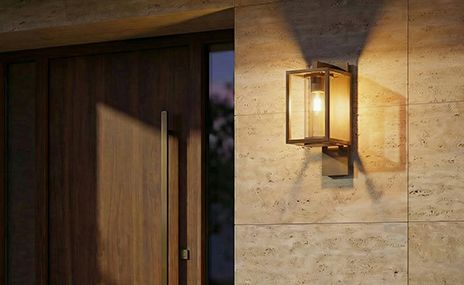
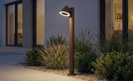
Brown, rust-coloured & deep red outdoor lights
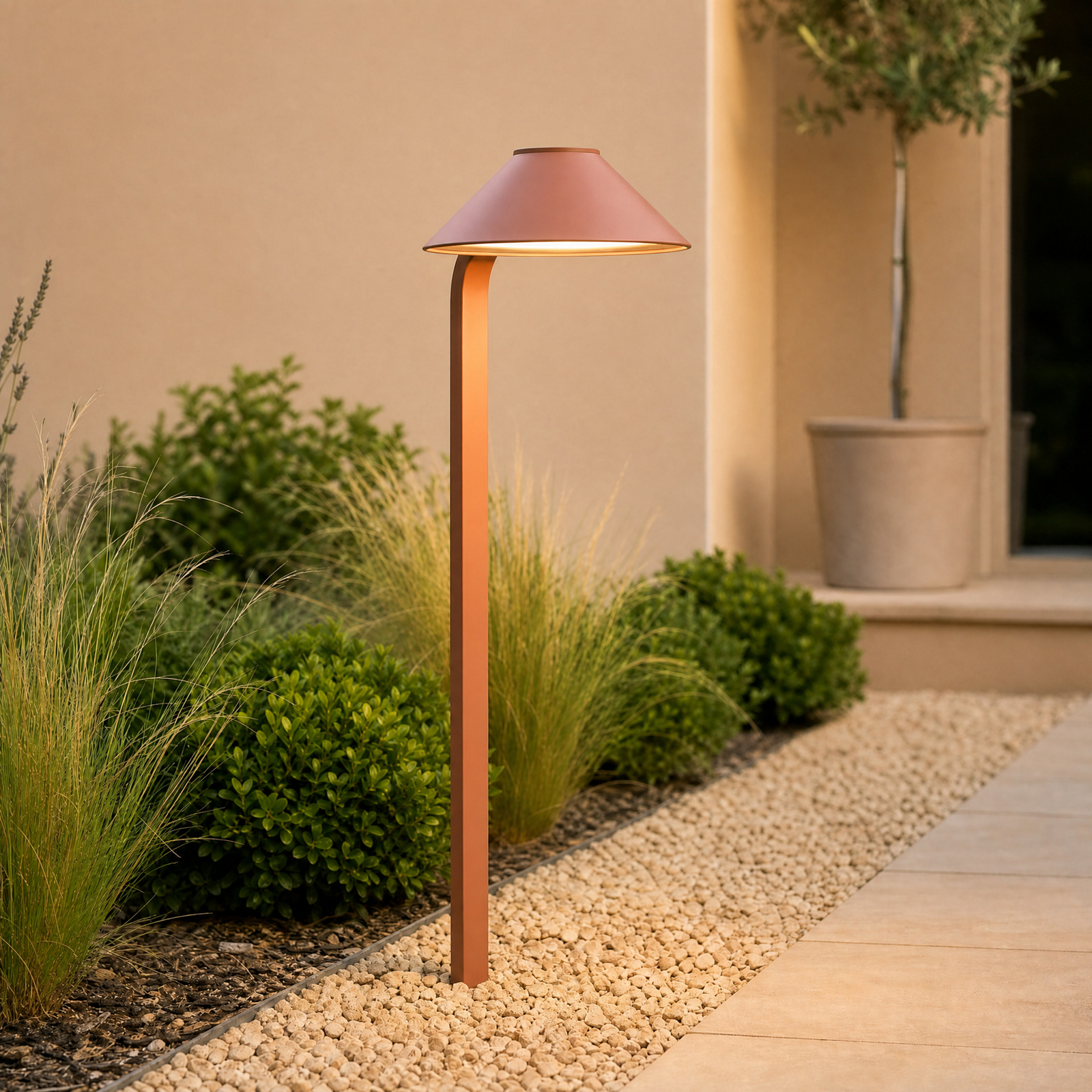
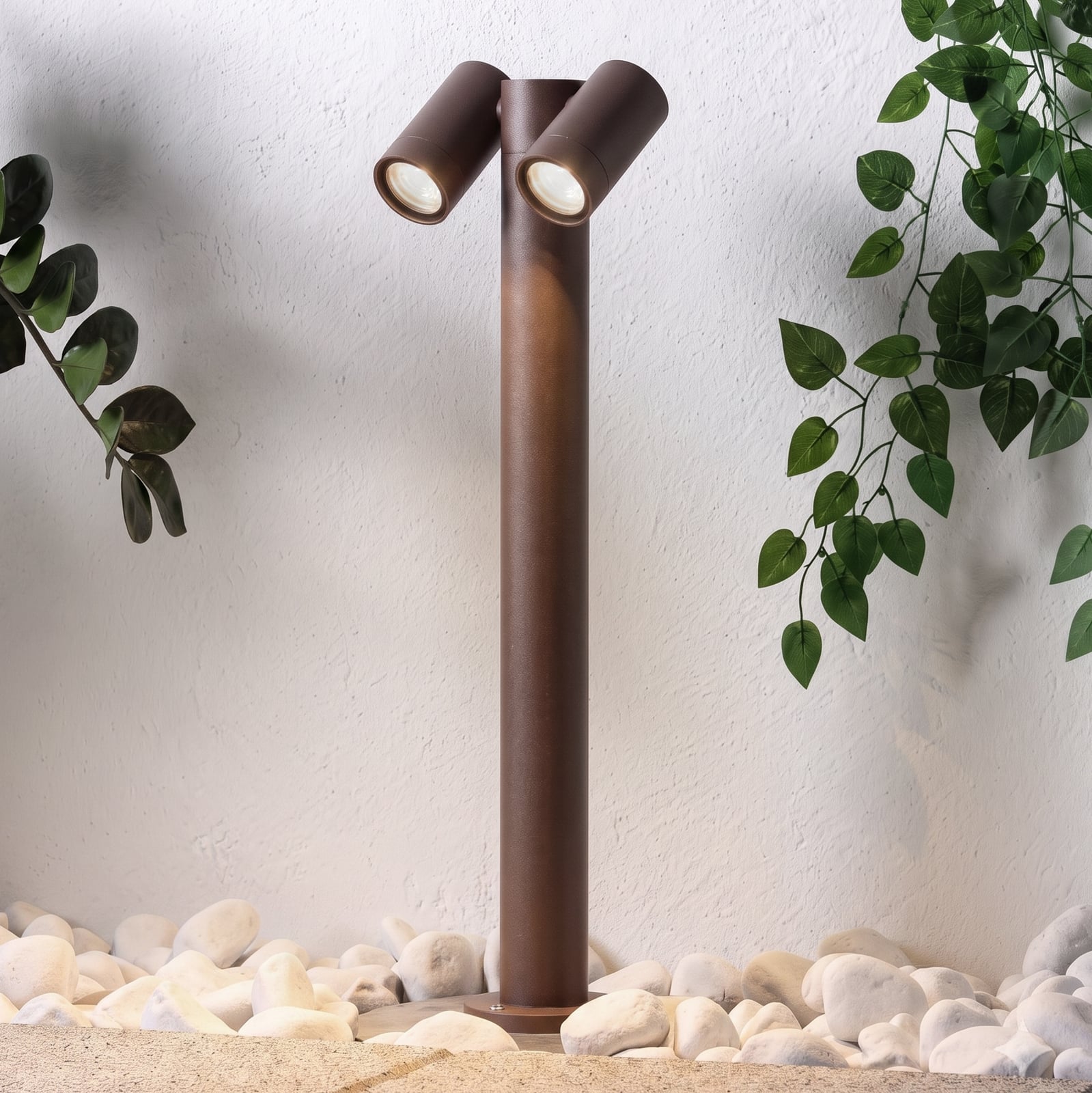
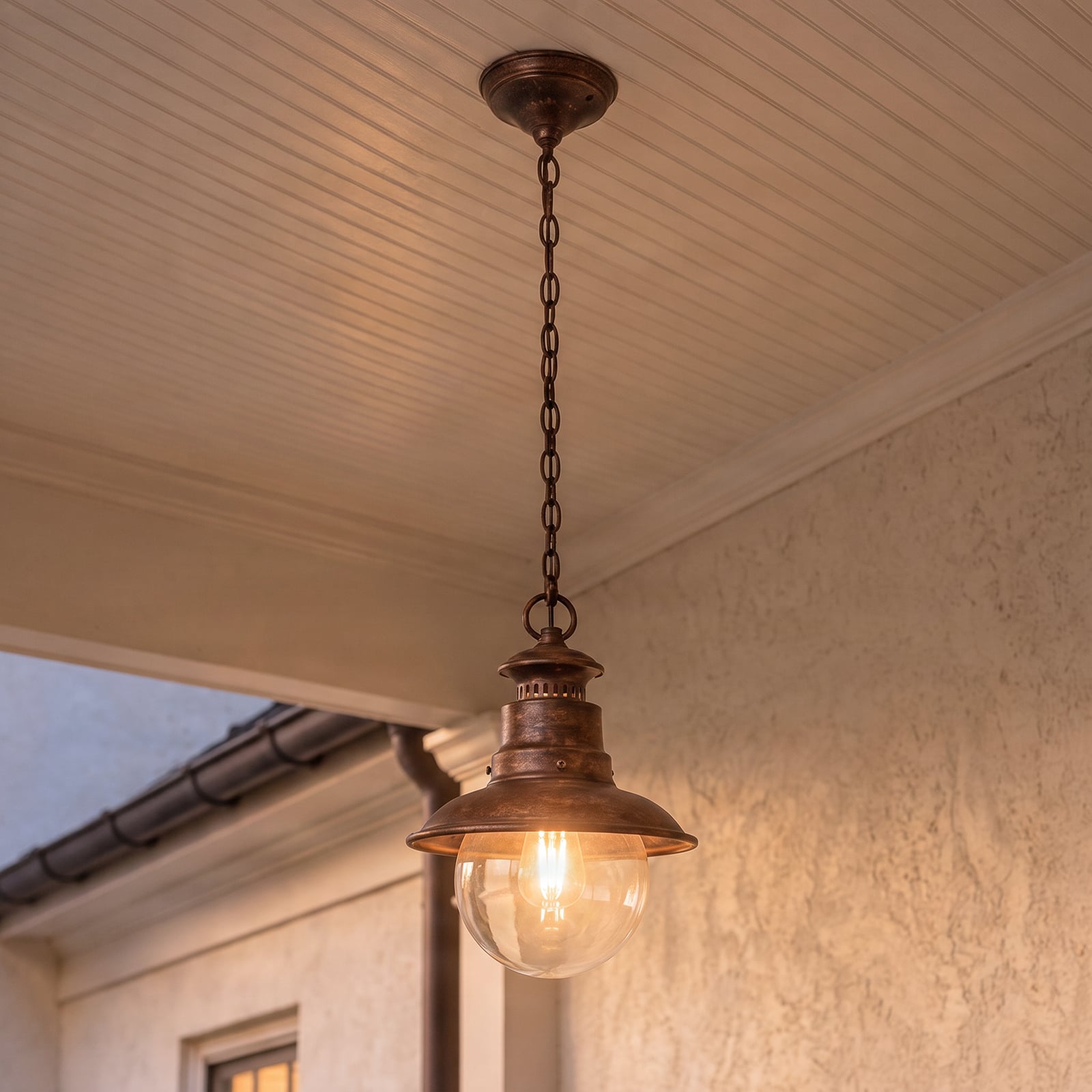
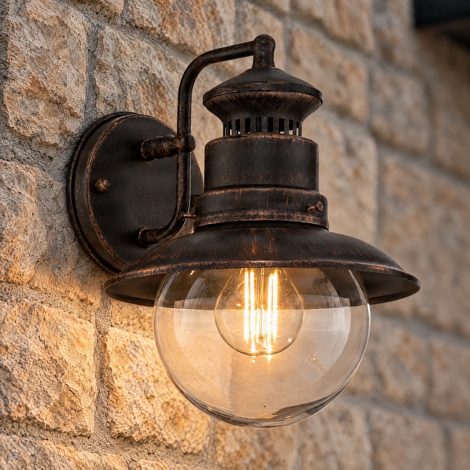
Warm, natural tones throughout the homeOutdoors, too, lights can be more colourful than just black and anthracite. Dark browns, rust, terracotta and rich reds blend naturally into natural surroundings and harmonise with wood, stone, earth and lush greenery. At the same time, they appear softer and warmer than the classic dark neutral colours. Rust-brown path lights, outdoor wall lights in deep brown shades or models with bronze-coloured details add subtle accents to the façade, patio and garden. The interplay with warm white light is particularly striking, as it gently highlights the dark surfaces in the evening.
Here, too, the colours of the surroundings can serve as inspiration: rust echoes the warm tones of brick and autumn leaves, brown blends with wood and earth, whilst red adds an elegant touch. This creates a harmonious overall look around the home that appears both natural and full of character.